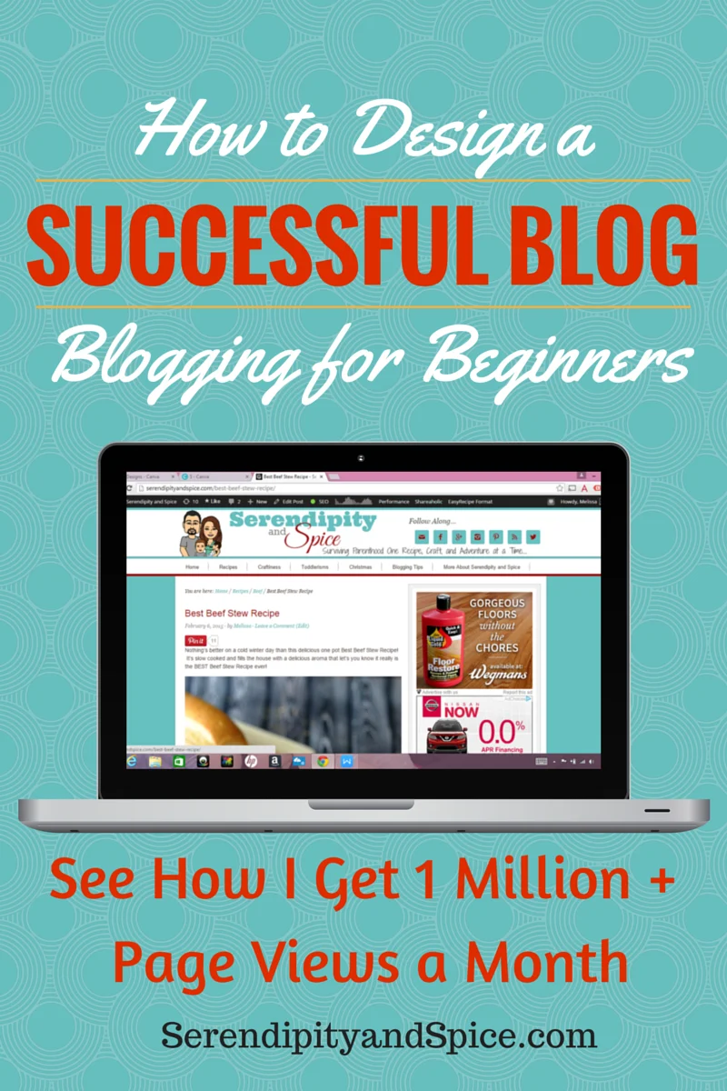
The design of a blog is the most important feature of a successful blog! There’s a certain way for how to design a successful blog….you want it to look professional so people keep coming back!
How to Design a Successful Blog
Over the past few months I’ve been asked over and over again from friends, family, and readers “how do I start a blog?”. Well, over the next few weeks I’m going to show you how to build a successful blog.
What you’ll learn-
- How to start a successful blog.
- How to design a successful blog.
- How to set up your social media.
- How to make graphics for your blog.
- How to improve your blog photos.
- How to monetize your blog.
- Recommended WordPress Plugins and Widgets.
- And so much more…..
I never expected Serendipity and Spice to grow like it has and actually become successful….it was just my way of connecting with the world as a new mom and giving myself something to do during those long nights of Little Man keeping me up. Well, here we are, 3 years later and I’m making a full time income, starting another blog, writing an e-book, and getting over 1 million page views a month!
Over the years I’ve been through numerous design changes which have been extremely time consuming and left very little cohesiveness in my blog posts. I probably would have done better to just hire someone out that knows how to design a successful blog. But, through trial and error I have learned the best ways to design a blog so it’s a success.
1. Choose a Theme
The main thing you want to focus on is the theme and overall look of your blog. Like we talked about last week in How to Start a Successful Blog you need to make sure that you have purchased your domain name, hosting (I recommend BlueHost— they’re cheap and you’ll get your domain for free), installed WordPress.org, and picked out a framework/theme. I use the Genesis framework with the child theme Innov8tive….most bloggers either LOVE Genesis or Thesis…these are the two primary frameworks…it really just depends on your personal preference. I do recommend going ahead and spending the money to purchase one of these frameworks and child themes because it will make life so much easier.
Every time you decide to change your theme you’ll wind up having to remake your logo, header, and other custom buttons to make sure that they fit the new theme correctly. That’s why it’s so important to choose a theme and stick with it.
2. Choose a Color Scheme
I suggest picking out 4-5 colors that complement each other and using those for everything….this will create cohesiveness throughout your blog. As you can see I’ve chosen teal, rust, gold, and white for my color scheme….but I didn’t just choose colors…I found the EXACT color hex codes that I wanted. The hex codes are written down in my blog notebook on the front page and I ONLY use these codes when making anything for Serendipity and Spice.
My favorite place to look for a color palette is Color-Hex. Color-Hex already has tons of complementing palettes put together….just click on the one you like and it will give you the hex codes for every single color.
The most important design tip that I have is to embrace the white! Initially you may think it’s boring but using a white background will make everything look crisp and clean. You don’t want your blog to be overwhelming….you want it to be visually appealing, easy to read, and professional looking.
3. Design a Logo
This is quite possibly the most difficult part of designing a successful blog…I’ve redone my logo more times than I can count! You need to decide what you would like your logo to convey about your site. Right now, my logo is a young family because we’re all about “Surviving Parenthood”. I highly suggest hiring this project out because you could spend HOURS trying to decide on the perfect logo….I’ve spent countless hours reimagining my logo design and I’m still thinking about changing it again.
Check out Fiverr for some amazing graphic artists that do this for a living! Fiverr is super inexpensive….the concept is that you can have a logo custom designed for just $5…but don’t stop there…many of the artists will go ahead and do all of your headers and blog icons for a nominal fee. So if you’re not technically savvy (like me) then I suggest just hiring it out and saving yourself hours of time and a BIG headache. 🙂
4. Design Your Headers/Blog Icons
My favorite program for designing headers is PicMonkey. PicMonkey is great because you can choose the size of design that you want to do and it has so many fonts, clipart, effects, etc. And if you sign up for the premium service which is super affordable you have access to so much more! I also use PicMonkey to make blog graphics and to edit my pictures….it’s so much easier to use than PhotoShop!
What you’ll need (all sizes are in px):
- Blog Header- size is dependent on the theme you choose but it will tell you in the customize tab the size header that you need.
- Social Media Icons for blog 50×50
- Facebook Timeline- 849 x 313px
- Facebook Profile Photo- 180 x 180px
- Facebook Apps- 111 x 74px
- Twitter Cover- 1500 x 500 keep elements in 1500 x 354 make the rest white space
- Twitter Profile Photo- 400 x 400
- Google+ Cover- 480 x 270
- Google + Profile Photo- 48 x 48
- Pinterest Profile Photo- 153 x 153
I’m also just learning Canva which is another great program for making blog graphics. It’s not as versatile as PicMonkey for editing photos but it does have some great fonts and clip art designs. Canva charges by the design for premium features at $1 per feature. So depending on what you want to do with your graphics PicMonkey’s monthly membership may actually be cheaper than Canva….both are great in their own ways.
5. Choose Your Fonts Wisely!
Okay, so I know we all LOVE pretty fonts…unfortunately they’re not easy to read for everyone. When choosing your fonts for writing blog posts I highly suggest sticking with a simple block style font. You can use the script fonts for headings but stick with easy to read for the body of your blog.
There are three main types of fonts….
- Serif
- Serif fonts have the little lift at the ends. It’s a block font but has a little extra style to it!
- Sans-Serif
- Sans-Serif is basic straight line fonts. There are no lifts at the end…these are the easiest to read!
- Script
- Script fonts are fancy and more difficult to read. It’s best to leave script fonts for headings or as a highlight….please, please, please DO NOT write your blog in script. Many people think that using script makes it more like they’re personally writing the post in handwriting but it’s just too difficult to read and you will loose readers.
Now there are other classifications of fonts like Greek, Dingbats, etc. But these 3 are the main styles that you’re going to use in writing.
6. Setting Up Categories and Menus
One thing that I’m working on right now for Serendipity and Spice is fixing my categories and menus. When I first started blogging I just made categories up as I went along– which lead to me have dozens and dozens of categories making my blog a pain to navigate.
Decide now what categories you want to cover in your blog and go ahead and add those to your menu (you can do this in a blog post- in WordPress the widget is on the right- just “+Add New Category” then un-check it for that post.
Right now I’m narrowing down my categories to have – Recipes, Crafts, Adventures, Blog Tips, and About Me. Then I’ll have sub-categories under each of these main categories. The main categories are what will be along the menu bar of your site….your sub-categories will be the drop down section. For example, the category Recipes will have the sub-categories: Slow Cooker Meals, One Dish Meals, Main Dishes, Veggies/Sides, Desserts, Drinks, Breakfast, and Snacks.
I suggest drawing out how you want your menu set up before you start making categories….this will make it easier to designate categories once you start writing posts.
Don’t overdo your category selections….try to keep them broad and simple. You can create tags that will narrow down the subject of your posts better.
7. Decide on Sidebar Widgets
So, you want some stuff in your sidebars…but you don’t want to overdo it either. I would stick with a few 350 x 350 ad spots, a profile picture with a welcome (I’ll teach you how to make that in PicMonkey soon), your lead magnet (we’ll cover that soon- basically it’s getting people to subscribe to your weekly posts), a search bar, top posts, archives, etc. You want to keep your sidebar clean and easy to navigate. I highly suggest sticking with just a single sidebar….when you start getting double sidebars it starts to look spammy and your readers don’t know where to look.
Well, there’s my tips on how to design a successful blog! Keep it classy and clutter free! Next week we’ll talk about how to set up your social media accounts. Until then, make sure you read Starting a Successful Blog, Is Your Blog Legal, and Improving Blog Photos.


